
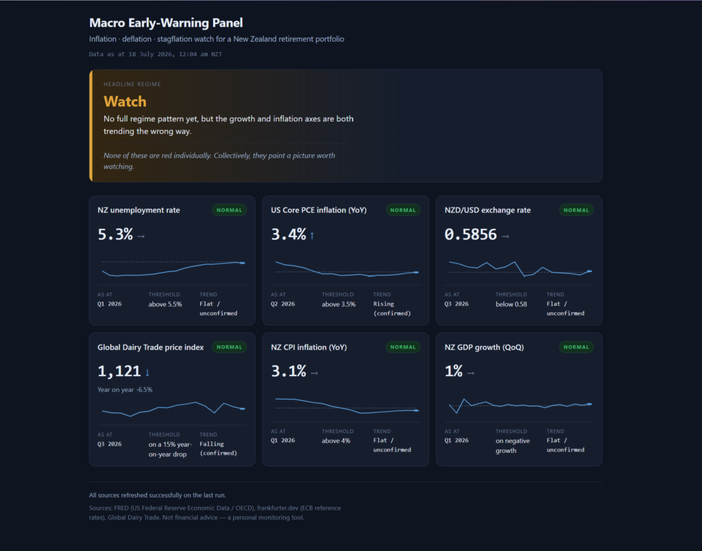
Four times a year, when Stats NZ releases the CPI, I open an Excel spreadsheet and type the number in by hand. Unemployment when it comes out, the exchange rate, dairy prices, GDP, US inflation; each one found on a different website, copied across, checked against the previous quarter. I have kept this spreadsheet going for some time now, and an early-warning panel that only warns when I remember to feed it is not much of an early-warning panel.
Some context on why I bother. Years ago, while I was still at ABN AMRO, I took the Certified Financial Planner course and passed the certification, never to practise it in public; I learned it to manage my own money, and the knowledge served me well. Now, as an early retiree, that decision pays for itself, because it pays to manage your own portfolio well rather than paying someone else to do it, and I am running mine through decumulation, where the macro regime matters more than any single stock pick, because the regime decides how much risk I should be carrying at all. What I watch for are the three conditions that hurt a retiree’s portfolio in different ways: inflation, deflation, and stagflation. Over the years of manual tracking I settled on six indicators with hard triggers: NZ unemployment above 5.5%, US Core PCE inflation above 3.5%, the NZD/USD below 0.58, a 15% year-on-year drop in the Global Dairy Trade index, NZ CPI above 4%, and a negative quarter of NZ GDP. The signal I care about sits in the pattern across all six.
Some time back I tried to automate this myself in Python. I struggled, honestly. Part of it was the programming; the bigger part was discovering how many variables I hadn’t accounted for: which API carries which series, how each source dates its observations, what happens when a feed goes quiet. I gave up, and the spreadsheet won by default. Tedious, but it worked, in the way that typing numbers into cells every quarter “works.”
Then this year, with everyone talking about vibe coding, I decided the idea deserved a second attempt, this time with Claude Code doing the typing.
Under two hours
I wrote the request the way I would brief a contractor. The six indicators and their exact trigger thresholds. Two layers of logic: per-indicator status with a small history chart and a trend arrow, and above that a headline regime call (stagflation risk, inflation risk, deflation risk, watch, normal) driven by confirmed trends across three axes, where a confirmed trend means 3 consecutive quarters moving the same way. The hosting constraints: my WordPress site runs on Hostinger shared hosting, so the whole thing had to be one PHP script on a scheduled cron writing a data file, plus a static page reading it; no database, no server process, a folder I copy into public_html and it just works. I attached an image of how I wanted the dashboard laid out. And I defined done: the fetch runs end to end against live sources, the page renders against real data, the regime logic is proven by tests, and one data source gets deliberately broken to show the failure handling works before anyone tells me it’s finished.
I ran the prompt, revised it once, and end to end, from idea to a working dashboard tested against live data, we spent more than an hour but less than two. And the constraint was me. The machine was rarely waiting on itself; it was waiting on me, because at every fork I was validating and verifying with my own eyeballs before letting it move on. Two hours still surprises me when I type it, given what the same idea cost me in Python.
The two hours themselves are the part worth describing. Claude Code narrates as it works, a running commentary of what it’s checking and why, and some of it needs my answer, so I was reading the whole way through while keeping one eye on the token meter to see what all this thinking was costing me. And the commentary showed it thinking past the literal instruction. Before writing a line of code it verified every data source was actually reachable, because the whole architecture hinged on that. The Global Dairy Trade index has no public API and loads its numbers by JavaScript, so it read the site’s own app code, found the static JSON feed the charts call, and wired the scraper to that, built to shout if the feed’s shape ever changes rather than print a wrong number. When it found that the Stats NZ API needs a subscription key I hadn’t supplied, it declined to ship an untested adapter with guessed identifiers, saying plainly that claiming untested code works would be lying, and documented the upgrade path instead. It drew a distinction I hadn’t asked for, between a fetch that fails (mark the indicator Stale, keep the last good value, force the headline to Watch) and a source that succeeds but lags at origin (show the true data date and let me see the age). And at the end it broke the GDP feed on purpose, confirmed the Stale badge, the forced Watch and the error exit code all fired, then restored a clean run. The final test suite passed 23 out of 23.
Where we got stuck
One indicator refused to cooperate: NZ CPI. The US Federal Reserve’s FRED database carries nearly everything, including the NZ series via an OECD re-cut, and unemployment and GDP came through current. But FRED’s NZ CPI lagged 4 quarters behind, showing 2.5% for Q1 2025 when the real figure was 3.1% at Q1 2026. On a panel whose whole purpose is early warning about inflation, a year of lag on the inflation number is the one gap that matters; 3.1 sits a lot closer to my 4% trigger than 2.5 does.
So we hunted together. I suggested the Reserve Bank of New Zealand’s key indicators page, and we tested it in the browser side by side: the data is there, fresh, with history back to 1926. But the page sits behind F5 bot defence, so a PHP cron job gets served a JavaScript challenge instead of the numbers. Lovely data, unreachable by automation. Then I pointed at Stats NZ’s Infoshare, and it drove the site all the way to the export form before reporting back: the direct export needs a 42 KB form-state blob round-tripped on every call, an uploaded query file, and the full period list posted back, all behind Cloudflare. Technically scriptable, and it would snap the first time Stats NZ touched that page.
The irony is not lost on me. I worked at Stats NZ. Their numbers are the authoritative ones, and theirs was the single source we could not automate cleanly, because the proper API wants a subscription key and, worse, wants you to already know which of their scattered data products you’re requesting. That discovery problem put me off registering a key at all; it’s now a question I’m taking to my network contacts, to find the right API path for CPI and maybe GDP.
Where we landed is almost embarrassingly simple: a manual quarterly entry. CPI comes out 4 times a year, and each release I add one line to a config file, the same number I’ll be reading in the news anyway, while FRED’s older history fills in behind it for the chart. Mistype it and the card goes Stale, loudly. Thirty seconds a quarter, no key, no fragile scraper. For a quarterly series, that’s a better fit, and it replaced a spreadsheet’s worth of typing with one line.
What it actually felt like
The closest comparison I have is pair programming: one person at the keyboard, the other watching, questioning, supplying context the typist doesn’t have. I sat with 2 browser windows open, one reading the commentary and watching the tokens tick, the other checking the same data sources myself, verifying what it told me against what I could see. When it hit a fork it stopped, named the fork, and gave a recommendation; I made the call and it kept moving.
And the division of labour is what made 2 hours possible. The machine did the engineering I had already proven I couldn’t do alone; that Python attempt settled the question years ago. I did the parts it couldn’t: knowing that RBNZ and Infoshare existed as alternatives, judging that a manual entry is acceptable for a quarterly series, and above all knowing which six numbers matter and where the triggers sit, which came from the long stretch of doing the job by hand in Excel. The code took less than 2 hours. The specification took years of quarterly typing to earn. I suspect that ratio holds for most people trying this: the prompt worked on the first serious pass because I could define done precisely, and I could define done precisely because I had been the system I was replacing.
I briefed it like a contractor, with constraints and done-criteria. I attached a picture of the outcome. I stayed in the room the whole time, reading the commentary, because the questions it asked were exactly the ones worth answering well. And I checked its claims independently while it worked, the same courtesy I’d extend to any capable colleague I’d only just met.
The first real run of the finished dashboard came back Watch: dairy prices falling into rising US inflation, the dollar leaning on 0.58, nothing red on its own. Which is precisely the framing line I asked to be kept visible on the page: “None of these are red individually. Collectively, they paint a picture worth watching.”
The dashboard is now live beside Strategic Kata. The cron runs on the 1st and 15th of each month, timed to the Global Dairy Trade auctions, the fastest-moving of the six feeds; the quarterly series refresh as their releases land, and the one CPI line each quarter is the whole of my remaining manual labour.
The spreadsheet is retired. I guess that makes two of us.