Category: Systems & Operations

Complexity, simplification, reliability, flow.

  • Vibe Coding: A Macro Early-Warning Dashboard

    Four times a year, when Stats NZ releases the CPI, I open an Excel spreadsheet and type the number in by hand. Unemployment when it comes out, the exchange rate, dairy prices, GDP, US inflation; each one found on a different website, copied across, checked against the previous quarter. I have kept this spreadsheet going for some time now, and let’s face it, an early-warning panel that only warns when I remember to feed it is not much of an early-warning panel.

    Some context on why I bother. Years ago, while I was still at ABN AMRO, I took the Certified Financial Planner course and passed the certification, never to practice it in public; I learned it to manage my own money, and the knowledge served me well. Now, as an early retiree, that decision pays for itself, because it pays to manage your own portfolio well rather than paying someone else to do it, and I am running mine through decumulation, where the macro regime matters more than any single stock pick, because the regime decides how much risk I should be carrying at all. What I watch for are the three conditions that hurt a retiree’s portfolio in different ways: inflation, deflation, and stagflation. Over the years of manual tracking I settled on six indicators with hard triggers: NZ unemployment above 5.5%, US Core PCE inflation above 3.5%, the NZD/USD below 0.58, a 15% year-on-year drop in the Global Dairy Trade index, NZ CPI above 4%, and a negative quarter of NZ GDP. The signal I care about sits in the pattern across all six.

    Sometimes back I tried to automate this myself in Python. I struggled, honestly. Part of it was the programming; the bigger part was discovering how many variables I hadn’t accounted for: which API carries which series, how each source dates its observations, what happens when a feed goes quiet. I gave up, and the spreadsheet won by default. Tedious, but it worked, in the way that typing numbers into cells every quarter “works.”

    Then this year, with everyone talking about vibe coding, I decided the idea deserved a second attempt, this time with Claude Code doing the typing.

    Under two hours

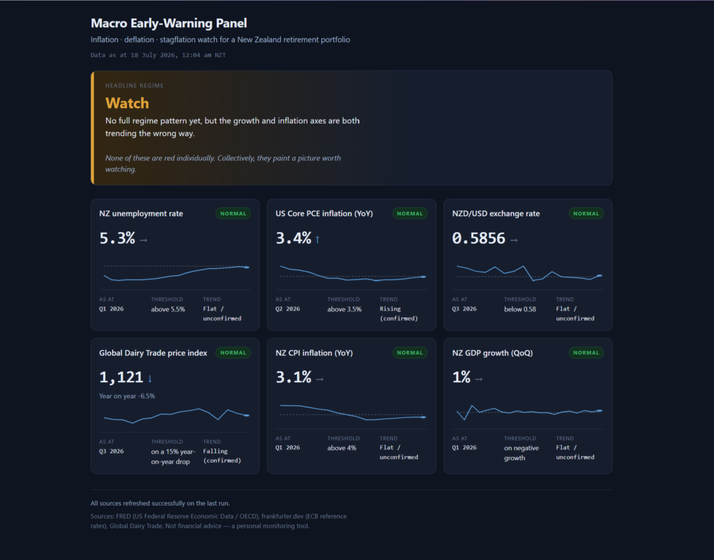
    I wrote the request the way I would brief a contractor. The six indicators and their exact trigger thresholds. Two layers of logic: per-indicator status with a small history chart and a trend arrow, and above that a headline regime call (stagflation risk, inflation risk, deflation risk, watch, normal) driven by confirmed trends across three axes, where a confirmed trend means 3 consecutive quarters moving the same way. The hosting constraints: my WordPress site runs on Hostinger shared hosting, so the whole thing had to be one PHP script on a scheduled cron writing a data file, plus a static page reading it; no database, no server process, a folder I copy into public_html and it just works. I attached an image of how I wanted the dashboard laid out. And I defined done: the fetch runs end to end against live sources, the page renders against real data, the regime logic is proven by tests, and one data source gets deliberately broken to show the failure handling works before anyone tells me it’s finished.

    I ran the prompt, revised it once, and end to end, from idea to a working dashboard tested against live data, we spent more than an hour but less than two. And the constraint was me. The machine was rarely waiting on itself; it was waiting on me, because at every fork I was validating and verifying with my own eyeballs before letting it move on. Two hours still surprises me when I type it, given what the same idea cost me in Python.

    The two hours themselves are the part worth describing. Claude Code narrates as it works, a running commentary of what it’s checking and why, and some of it needs my answer, so I was reading the whole way through while keeping one eye on the token meter to see what all this thinking was costing me. And the commentary showed it thinking past the literal instruction. Before writing a line of code it verified every data source was actually reachable, because the whole architecture hinged on that. The Global Dairy Trade index has no public API and loads its numbers by JavaScript, so it read the site’s own app code, found the static JSON feed the charts call, and wired the scraper to that, built to shout if the feed’s shape ever changes rather than print a wrong number. When it found that the Stats NZ API needs a subscription key I hadn’t supplied, it declined to ship an untested adapter with guessed identifiers, saying plainly that claiming untested code works would be dishonest, and documented the upgrade path instead. It drew a distinction I hadn’t asked for, between a fetch that fails (mark the indicator Stale, keep the last good value, force the headline to Watch) and a source that succeeds but lags at origin (show the true data date and let me see the age). And at the end it broke the GDP feed on purpose, confirmed the Stale badge, the forced Watch and the error exit code all fired, then restored a clean run. The final test suite passed 23 out of 23.

    Where we got stuck

    One indicator refused to cooperate: NZ CPI. The US Federal Reserve’s FRED database carries nearly everything, including the NZ series via an OECD re-cut, and unemployment and GDP came through current. But FRED’s NZ CPI lagged 4 quarters behind, showing 2.5% for Q1 2025 when the real figure was 3.1% at Q1 2026. On a panel whose whole purpose is early warning about inflation, a year of lag on the inflation number is the one gap that matters; 3.1 sits a lot closer to my 4% trigger than 2.5 does.

    So we hunted together. I suggested the Reserve Bank of New Zealand’s key indicators page, and we tested it in the browser side by side: the data is there, fresh, with history back to 1926. But the page sits behind F5 bot defence, so a PHP cron job gets served a JavaScript challenge instead of the numbers. Lovely data, unreachable by automation. Then I pointed at Stats NZ’s Infoshare, and it drove the site all the way to the export form before reporting back: the direct export needs a 42 KB form-state blob round-tripped on every call, an uploaded query file, and the full period list posted back, all behind Cloudflare. Technically scriptable, and it would snap the first time Stats NZ touched that page.

    The irony is not lost on me. I worked at Stats NZ. Their numbers are the authoritative ones, and theirs was the single source we could not automate cleanly, because the proper API wants a subscription key and, worse, wants you to already know which of their scattered data products you’re requesting. That discovery problem put me off registering a key at all; it’s now a question I’m taking to my network contacts, to find the right API path for CPI and maybe GDP.

    Where we landed is almost embarrassingly simple: a manual quarterly entry. CPI comes out 4 times a year, and each release I add one line to a config file, the same number I’ll be reading in the news anyway, while FRED’s older history fills in behind it for the chart. Mistype it and the card goes Stale, loudly. Thirty seconds a quarter, no key, no fragile scraper. For a quarterly series, that’s an honest fit, and it replaced a spreadsheet’s worth of typing with one line.

    What it actually felt like

    The closest comparison I have is pair programming: one person at the keyboard, the other watching, questioning, supplying context the typist doesn’t have. I sat with 2 browser windows open, one reading the commentary and watching the tokens tick, the other checking the same data sources myself, verifying what it told me against what I could see. When it hit a fork it stopped, named the fork, and gave a recommendation; I made the call and it kept moving.

    And the division of labour is what made 2 hours possible. The machine did the engineering I had already proven I couldn’t do alone; that Python attempt settled the question years ago. I did the parts it couldn’t: knowing that RBNZ and Infoshare existed as alternatives, judging that a manual entry is acceptable for a quarterly series, and above all knowing which six numbers matter and where the triggers sit, which came from the long stretch of doing the job by hand in Excel. The code took less than 2 hours. The specification took years of quarterly typing to earn. I suspect that ratio holds for most people trying this: the prompt worked on the first serious pass because I could define done precisely, and I could define done precisely because I had been the system I was replacing.

    This is what I did; consider what applies to your situation. I briefed it like a contractor, with constraints and done-criteria. I attached a picture of the outcome. I stayed in the room the whole time, reading the commentary, because the questions it asked were exactly the ones worth answering well. And I checked its claims independently while it worked, the same courtesy I’d extend to any capable colleague I’d only just met.

    The first real run of the finished dashboard came back Watch: dairy prices falling into rising US inflation, the dollar leaning on 0.58, nothing red on its own. Which is precisely the framing line I asked to be kept visible on the page: “None of these are red individually. Collectively, they paint a picture worth watching.”

    The dashboard is now live beside Strategic Kata. The cron runs on the 1st and 15th of each month, timed to the Global Dairy Trade auctions, the fastest-moving of the six feeds; the quarterly series refresh as their releases land, and the one CPI line each quarter is the whole of my remaining manual labour.

    The spreadsheet is retired. I guess that makes two of us.

  • Arcane by Necessity

    At 2:00 am, just after the bots from the tax refund agents finished scraping the portal, we rebooted the servers.

    The servers were healthy. That was the point. By the time an out-of-support WebSphere Application Server tells you it’s unhealthy, you’re already inside a priority one incident, and a system serving every taxpayer in New Zealand is falling over with the whole country watching. So we rebooted while the country slept, on a schedule built from our own data, and nobody outside the team ever knew it happened.

    This was Inland Revenue between 2013 and 2015, and this piece is about how a team ran the machinery of the New Zealand tax system on technology officially past its life, with methods you could politely call arcane, because we had no other choice.

    The Mandate

    My boss that ran Business Platform Services was a tough fellow who made sure you knew what you signed up for. Hands off otherwise, which suited me fine. He had one famous line, delivered whenever shit hit the fan: “We are here to protect the integrity of the tax system. This is what you signed up for and what the Act says.”

    The Act is the Tax Administration Act 1994, and he wasn’t quoting it for effect. The integrity of the tax system is a statutory obligation, and whenever a P1 landed, or the tax agents flooded us with complaints about the portal, he’d deliver the reminder again: you are responsible and accountable for the integrity of the tax system.

    So the obligation was fixed. Absolute, written into law, indifferent to our circumstances.

    The resources were fixed too, in the other direction. Inland Revenue was waiting for business transformation, and everything in the estate was being sweated to survive until the new world arrived. We were two versions behind. End of WebSphere Application Server 6.1 support from IBM due on September 2013. Aging hardware, aging tools, and no appetite to invest in a platform that transformation was going to retire anyway. My team, Business Platform Services Channels, owned the digital services end to end: online, B2B, voice, and output services. That was about 40 percent of Inland Revenue’s ICT applications, but 68 to 70 percent of all application interfaces flowed through Channel, because we were the layer between the customer and everything behind us in the service line: database, then middleware and application, then the mainframe at the back.

    And the load had teeth. Tax peak ran from the end of March to August. Tax agents ran refund services that scraped our portal relentlessly, their bots hammering the front end through the night on behalf of clients chasing refunds. Every one of those requests travelled through infrastructure that its own vendor no longer supported.

    When the obligation is absolute, the resources are frozen, and the load keeps rising, the only variable left is method.

    Year One: Reactive

    Our first year was fraught. When a WebSphere server hit its limit, the fastest recovery was a reboot, so we rebooted, sometimes in the middle of the business day. And sometimes the second server failed while the first was coming back, because it took the full load alone and buckled under it, which turned a recovery into a bigger incident than the one we started with. We were learning the hard way that on old infrastructure, the cure can cascade.

    Late night calls were routine. Teru, my Senior IT Consultant, would get the pager, an impromptu meeting would form on the phone with the Incident Resolution Lead and whichever technical specialists the failing system had dragged out of bed, and the discussion usually ended the same way: a call to reboot. I made that call, every time. The responsibility and onus sat with me as the end-to-end service owner for digital services, and that’s what owning a service means at two in the morning.

    We logged 33 priority one incidents that first year. I told the story of what the whiteboards and the visible metrics did about that number in Two Kinds of Visibility. This piece is the other half of how the numbers came down.

    The Turn

    We learned the behaviour of our servers the way you learn the behaviour of an old car: by paying attention to it for long enough. We collected data. We correlated system variables, CPU, cache, database log files, with the tax calendar and with application releases, and slowly the patterns showed themselves. It wasn’t rocket science. A server that buckles every time a certain filing date meets a certain cache level isn’t mysterious; it’s predictable, and predictable is workable.

    We built benchmark numbers for when each server would need a reboot to clear its cache. And once we could forecast the failure, we stopped waiting for it. We scheduled the restarts for the hours when New Zealand was inactive and asleep. Dawn, just before people came to work. Or 2:00 am, just after the refund agents’ bots finished their scraping runs. The same reboot that had been a midday emergency in Year One became an invisible maintenance routine in Year Two, and that shift is a large part of why Year Two improved so dramatically on Year One.

    The War Room

    Through tax peak we ran a war room. Every morning, representatives from Channel, Database, Middleware and Application, Mainframe, and Service Management sat in one room, the entire service line from customer to mainframe, and I chaired the briefing.

    The rhythm was fixed. Yesterday’s summary first: what we saw, what happened, what action was taken. Then each area updated the health of its systems and applications in turn. Then the tax calendar, so our activities synchronised with what the country was about to do to us. Then the threshold forecasts, which servers were approaching a reboot and when we’d take them. Then pending releases from Development and any fixes we had scheduled ourselves. Service Management kept us compliant with the ITIL process flows and coordinated the preparation whenever a service outage had to be planned for. And when something critical needed a decision on the spot, the BPS managers joined the room and the decision got made there and then, with everyone who’d have to live with it present.

    Written down like that, it sounds almost formal. In practice it was a group of people running a national system on obsolete kit with a whiteboard, a pager, and a forecast, and everyone in the room knew exactly why. The Act didn’t care what version of WebSphere IBM still supported.

    What Constraint Actually Does

    Constraint tends to get either romanticised or pitied, and I think both readings miss what happens inside it. Nobody in that war room would have designed the operation this way. Given the choice, we’d have taken supported servers, modern tooling, proper capacity headroom, and full nights of sleep. We were never given the choice, and the obligation didn’t shrink to fit the resources, so ingenuity became the bridge between them. The data collection, the correlation with the tax calendar, the benchmark thresholds, the dawn reboots: every one of those practices exists because a gap existed that money wasn’t going to close.

    That’s usually what arcane methods are, when you stumble across them in an organisation and wonder why on earth things are done that way. They’re the archaeology of some past gap between what had to be done and what was available to do it with. Before you rip one out, it’s worth finding the gap it was built to span, because the gap may still be there.

    Business transformation did eventually arrive, years after I left in October 2015, and it retired the estate we’d been sweating. I doubt anyone still remembers the 2:00 am reboots, and honestly, that was the whole idea; the best nights were the ones nobody noticed.

    It was what we signed up for.

  • What AI Exposes – Part 4 of 6

    AI speeds up everything except the constraint. And the constraint is rarely the technology.

    Every executive board I’ve sat in front of, whether at Te Wānanga o Aotearoa, Te Pūkenga, or earlier in my career, had the same shape underneath it, regardless of what the organisation actually did.

    Papers had to go in weeks ahead of the meeting. There was a format, usually one set by governance requirements flowing down from a central government agency, and the format asked the same kind of questions every time. What were the procurement options. What competing quotes did you receive. How did you arrive at this recommendation. What’s the financial case. As a senior leader, you’d spend real time, real effort, getting that paper into shape, because the format mattered as much as the content, sometimes more.

    And here’s the thing I noticed, the same thing in more than one organisation. Below a certain financial threshold, things moved. A CEO’s financial delegation might cover spending up to a certain amount, and inside that boundary, decisions happened at a reasonable pace, weeks, not months. Above that threshold, technology spending had to go to the board, or to the chairperson, or to a steering committee specifically constituted because the programme had crossed, say, a million dollars. And the moment something crossed that line, the pace changed completely. Not because the work got harder. Because the decision now belonged to a different cadence, board meetings, steering committee meetings, a calendar that ran on its own schedule regardless of how ready the work was.

    Once you got past that approval point, interestingly, things sped up again, often quite quickly. Which tells you something important. The slowdown wasn’t about complexity, or capability, or even risk, not really. It was about which side of a financial line the work happened to sit on.

    That’s the constraint. Not the technology, not the team, not even, most of the time, the people sitting on the board. The constraint is the threshold itself, and the cadence that governs anything above it.

    Now think about what AI actually speeds up in this picture.

    AI is very good at producing exactly the kind of paper that format demands. Procurement options, comparative analysis, draft business cases, the research that goes into “how did you arrive at this recommendation.” All of that gets faster. A paper that used to take a team two or three weeks to assemble properly could, with AI doing a lot of the drafting and research legwork, come together in days.

    So picture what happens. More papers, better researched, arriving faster, all queuing for the same board cycle, the same steering committee cadence, the same financial delegation threshold that hasn’t moved an inch. The constraint doesn’t get any faster just because the things arriving in front of it got faster to produce. If anything, the queue gets longer, because now it’s cheaper and quicker to generate a business case, so more of them get generated, and they all still have to wait for the same monthly or quarterly slot.

    This is the part that I think gets missed in most conversations about AI and productivity. Speeding up the non-constraint doesn’t speed up the system. It just means the constraint now has more sitting in front of it, dressed more convincingly, on the same clock as always.

    At Te Pūkenga, this played out in a very specific way. There was a real appetite, especially in technology, to move fast, to make decisions and adjust later if needed. Seek forgiveness rather than permission, the old phrase. But that approach, taken too far, breaks the agreement between the organisation and central government, the governance arrangement that the financial delegation and steering committee structure exists to protect. So the choice sat with whoever held the role, often the Chief Digital Officer, and it wasn’t really a technology choice. It was a political one. Move fast and risk the relationship with the centre, and your own position along with it, or stay inside the governance lines and accept that the pace is set by someone else’s calendar.

    Most people, reasonably, chose the second option. And the work that had been done, the research, the supplier engagement, the commitment built with development teams, much of it sat there, not wasted exactly, but not moving either, while the business division absorbed the cost of effectively standing still. Spinning the wheels, consuming budget, with nothing to show for it on the outside, because the thing that needed to move was waiting on a decision that hadn’t been made.

    And here’s where it gets sharper still, because indecision isn’t neutral. Indecision is itself a decision, usually the decision to keep the status quo running for as long as possible.

    At Inland Revenue, I started in January 2013. My first day on the job, we were hit with a Priority 1 incident, the kind that takes taxpayer-facing systems down entirely. My senior manager introduced me to the floor and told everyone I was the one who’d sort it out. That was day one. By the end of that year we’d had more than thirty Priority 1 incidents, on top of everything lower in severity that never made it into anyone’s headline numbers.

    The infrastructure behind it told you why. The WebSphere Application Servers running our channel systems were three versions behind current, and they buckled under unusual load, especially during the tax peak season running April through August, exactly when the system needed to hold up the most. The Business Platform Services Channels team I was part of handled roughly 70% of IRD’s systems through its public-facing portal. Alongside that, the document management platform, an IBM Enterprise Content Management system that every tax form and every piece of taxpayer correspondence ran through, was already out of vendor support. We were paying IBM a premium just to keep getting support on a platform it no longer wanted to support, because the realistic fix, an upgrade to the lowest version still covered, never quite made it to the front of the queue.

    Every outage got noticed. Leadership attention, public criticism, press coverage, a tax agency whose own systems taxpayers couldn’t access to file their returns, accountants scrambling to lodge clients’ returns through whatever workaround they could find. None of that is a small thing for an organisation whose entire mandate depends on people trusting the system enough to use it.

    Keeping that infrastructure at 99.9% availability through tax season took real ingenuity, because the investment to actually fix it properly wasn’t coming. Leadership knew it. The plan, such as it was, was to sweat the assets for as long as they could be sweated, until the broader Business Transformation programme eventually arrived to replace everything properly. In the meantime, the onus sat with the people in Business Platform Services, keeping a system three versions behind current running at a reliability target that newer infrastructure would have struggled to hit without strain.

    That requirement didn’t soften just because the underlying technology was ageing and the replacement programme was stuck in a queue somewhere above someone’s financial delegation. The risk of that gap, between what the system was being asked to do and what it was realistically capable of doing reliably, didn’t sit with whoever was holding up the approval. It sat with the people keeping the lights on every day, the ones whose job it was to make 99.9% happen on infrastructure that leadership already knew was past its best.

    This is what I mean when I say AI exposes the constraint rather than removes it. If AI is used to speed up the analysis, the business cases, the options papers, the reporting, exactly the things that feed into a board cycle or a steering committee, none of that touches the actual bottleneck, which is a financial threshold and a meeting cadence set by governance arrangements that have nothing to do with how fast anyone can write a paper. What changes is the size and polish of the queue sitting in front of that bottleneck, and the distance between what’s technically possible and what’s actually approved gets more visible, faster, because the technical side is now moving at AI speed and the governance side is moving at the same speed it always has.

    The gap was always there. Sweating the IRD assets, the Te Pūkenga standstill, these existed long before anyone in those organisations had touched an AI tool. What AI does is make the two speeds, the speed of producing the case for change and the speed of actually deciding on it, diverge so sharply that the gap stops being something you can quietly manage and starts being something everyone downstream can see.

    I think that’s worth sitting with, if you’re the one several layers down, keeping something running at 99.9% while the decision about its future sits in someone else’s inbox. AI won’t move that decision any faster. It’ll just make it more obvious, to more people, sooner, exactly how long that decision has been sitting there.

    Leadership, in my experience, genuinely doesn’t see this whole chain. They see their piece of it. The approval is pending, that’s a known item on a register somewhere, fine. The systems are running, availability targets are being met, also fine. Nobody in the room is looking at the line connecting those two facts, that the second fact is only true because of effort and risk being absorbed by people several layers down, for as long as the first fact remains unresolved. As long as it isn’t front-page news, the risk reads as managed.

    I’ve been on both sides of that gap. I know which side feels the cost first.

  • Two Kinds of Visibility

    One morning in 2013, a senior manager stopped at our whiteboard at Inland Revenue while my team was running through the day’s incidents, looked at the columns of cards for a while, and said, “Wayne, we don’t do agile here.”

    I said, “No, we’re doing TPS. Toyota Production System.”

    She wasn’t satisfied with that. “Just remember, Inland Revenue doesn’t do agile.” Then she walked off.

    She ran ICT Solutions. She had sat on the panel that hired me. And she had carried Mary and Tom Poppendieck’s Lean Software Development around during her MBA sometime later, which made the line even better.

    That was the entire exchange. Nothing came after it, no memo, no meeting invite to discuss my team’s unauthorised working methods. And looking back, the reason nothing came after it is the whole point of this piece. We never asked permission for what we were doing, and we never argued for it in a meeting room either, because we would have lost that argument. We did the work where people could see it, and let the results carry the case.

    Some context first. I ran Business Platform Services Channels at Inland Revenue from January 2013 to October 2015, a team of 11 or 12 looking after the systems sitting between New Zealand taxpayers and everything behind the portal. Channel owned about 40 percent of Inland Revenue’s ICT applications in its own right, but as the front end of the service chain, up to 70 percent of all application interfaces flowed through us on their way to the middleware, the databases, and the mainframe at the back. So any incident touching the portal got assigned to us to triage first, whether or not the fault actually lived behind us. We wore every complaint, and that’s how busy we were: sifting through the shit to work out whose it was. When the portal goes down, nobody rings the database team.

    The technology was waiting for business transformation to arrive. WebSphere servers out of support from IBM, infrastructure being sweated to survive until the new world got funded and built. Least resources, oldest kit, first in line for blame. And in my first year, 2013, we logged 33 priority one incidents. Thirty-three times in a single year, a system serving every taxpayer in the country fell over badly enough to be declared a P1.

    What We Actually Did

    Every morning we stood at a whiteboard and went through the work. To do, in progress, done. Whatever needed attention across the entire service line got a card. This wasn’t proper agile; there was no Scrum Master and no sprint cadence, because production support doesn’t run in sprints. Incidents don’t wait for planning day. We were level 2 and level 3 in the support chain, taking what the Service Desk at level 1 passed up, triaging it the way an emergency department triages patients, firming up the diagnosis, fixing what we could ourselves, and passing the rest to the development teams at level 4. Inland Revenue had run Scrum on some projects before, and several of my people knew the ceremonies well, so the muscle memory was there. We simply pointed it at operations instead.

    I called it Toyota Production System because that’s what it was: make the work visible, limit what’s in progress, let the team pull the next priority, and treat every incident as a signal about the system rather than a fire to forget once it’s out.

    Teru Yanagihasi, my Senior IT Consultant, took the visibility further than I would have on my own. He put a metrics dashboard straight onto the whiteboard, openly displaying where the issues actually lived across the service line, which trends were building, what needed watching next. He also introduced a Niko Niko board, a Japanese practice where each person marks their mood for the day, which sounds soft until you realise it tells you about the condition of the team before the incident queue does. A tired team misses thresholds. Many of the ideas that worked in that team started as Teru’s; his dedication and commitment were second to none.

    None of this was electronic. There was no tooling budget. Whiteboard, markers, and a team that showed up every morning.

    My peers and my leadership tolerated all of it, I guess because the numbers kept moving in the right direction and it cost them nothing to look the other way. The P1 count kept falling, and they left us alone. Results bought us an autonomy that no argument would have.

    The Viral Part

    Then something happened that I didn’t plan. Colleagues from the other Business Platform Services teams walked past our corner, saw the board, watched the morning ritual for a while, and whiteboards started appearing in their spaces too. Nobody mandated visual management. There was no workshop, no change programme, no lunchtime session on lean methods. The practice spread because it sat in the line of sight of anyone walking the floor, and because the thing it was attached to, our incident numbers, was visibly improving month after month.

    Eventually my Director for ICT Operations bought us a 45 inch TV to display our monitoring dashboards, an envy to the rest of BPS. I suspect that TV did more for adoption across the floor than any presentation I could have given.

    The numbers are the part I can still recite. 33 priority one incidents in 2013. Seven in 2014. Three in 2015, my final year.

    Behind those numbers was a team watching thresholds against upper control limits, CPU, cache, database log files, queue depths, and taking preventive action in quiet hours before any limit was breached. The whiteboard made the priorities visible. The dashboards made the thresholds visible. The discipline was simply that somebody was always watching and always acting early, and that discipline held availability at 99.9 percent through tax peak seasons, on assets that were officially past their support life. How we sweated those assets through peak season deserves its own piece, so I’ll leave that story for another day.

    The Newsletter

    Three P1s in a year got attention at the top. The CIO came down and asked what we had done to make that possible, and then he wanted a piece in the internal newsletter about the improvement in operations.

    Here’s where I learned something about visibility that the whiteboard hadn’t taught me. I told him the truth: we relied on more eyeballs watching the thresholds of the upper control limits for failure. He looked puzzled. I explained the eyeballs again, and he looked more puzzled. You can’t write “we watched harder and acted earlier” in a newsletter. There’s no chart for it, no milestone, no budget line, nothing that reads like an achievement.

    In the end, I suggested he attribute the improvement to the mainframe, since we had a mainframe project running at the time. A project is quantifiable. It has a name, a start date, an end date, a cost. It fits the shape a newsletter expects. So the mainframe got the credit, and I’m the one who offered it, because I understood the constraint he was working under. The improvement he actually came down to ask about was the ingenuity of an entire team monitoring thresholds and sweating aging assets, and that never gets published, because it sounds simple and boring.

    Two Kinds of Visibility

    I’ve thought about this a lot since. There were two kinds of visibility in that story, and they behave completely differently.

    Sideways visibility spreads practice. Peers copied the whiteboard because they could see it working with their own eyes, on their own floor, attached to numbers that kept falling; no persuasion required, no business case, no mandate. When results are physically visible, adoption becomes voluntary, and voluntary adoption sticks in a way that mandated change rarely does. That’s the persistence half of the story. We kept doing the same simple things, quietly, for three years, and the copying followed the results.

    Upward visibility grants credit, and it only registers what is countable and project-shaped. The institution could see the mainframe project because it had the right form. It couldn’t see the eyeballs, even when the person responsible stood in front of the CIO and explained them twice. So the official record of that improvement, if anyone ever digs out that newsletter, says the mainframe did it.

    Both kinds are real, and both matter. But if you run operations anywhere, it’s worth knowing that the work that spreads among practitioners and the work that gets credited by the institution can be entirely different work, and the gap between them is where a lot of quiet operational excellence lives and dies unrecorded.

    Teru returned to Japan after 2021. The senior manager was right in the end; Inland Revenue never did do agile, at least while I was there. It did TPS for three years in one corner of the floor, and the whiteboards told everyone who cared to look. Even she was converted before I left.

    I still think the eyeballs deserved the newsletter.