Author: Wayne Loke

  • Why Is Changing Culture So Hard?

    When we moved house, the hardest part was not the lifting. It was the packing, and inside the packing, the deciding. You pick up something you have kept for years, you hold it, and you have to work out whether it comes with you or goes into the pile for the op shop, and there is no right answer available to you at that moment, only a guess you will find out about later. On moving day the fear arrives in two flavours at once: that you have brought too much, and that you have thrown away too much. Both feel true simultaneously.

    Then you arrive, and it starts again. In the old house my study was on the first floor and the living area was downstairs. In this house it is the other way round, the study on the ground floor and the living upstairs, so for days I walked the wrong way out of habit. I opened the wrong drawer looking for the scissors. I could not remember which box the good knives had gone into, and I could not remember which cupboard I had decided the good knives should live in, because that decision had not actually been made yet, it was being made again every time I cooked. Then there is the street, the neighbours, the new routine, the drive to the shops that takes a different amount of time from the old one.

    None of that was a disaster. All of it was uncomfortable. And that discomfort, multiplied by a few hundred or a few thousand people, is what you are asking for when you stand up in front of an organisation and say we are going to change the culture.

    That is the part I did not say properly the first time I wrote about this in 2019.

    What I had then

    A few years ago, while I was at Stats NZ, I wrote a short piece asking why changing culture is so hard. I had the symptoms right. Not invented here, so nothing from an external origin is ever quite good enough. The organisation’s immunity system, which switches on the moment something threatens people’s influence and control, and which does not live in the leadership layer, it lives with the people who man the cogs. Culture wrapped around leadership, strategy, structure, process and people like a rubber band, so that when you pull on one part of it, the whole thing snaps back to where it started.
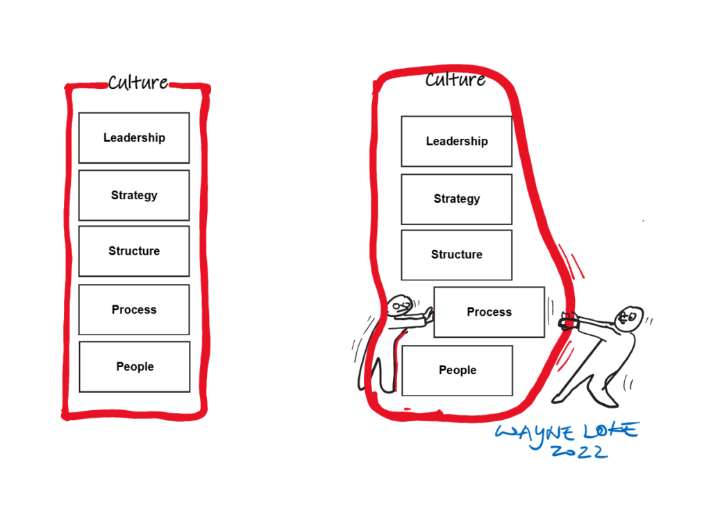
    A comic rendition of how culture is a rubber band binding leadership, strategy, structure, process and people. You push or pull any and it will snap them back to its origin state.

    I still think that is right. But it describes the machine, not the people inside it. What I could not name then were the two things underneath, the two that decide whether anything moves at all.

    Belief and fear.

    Belief

    The status quo is a comfort zone people have earned, day in and day out, over years of doing the same thing with no threat to their safety and no threat to their routine. Ask them to work differently and you are asking them to move house. The boxes, the wrong drawer, the scissors.

    So the standard answer is that you need a visionary leader, someone who paints the picture of the future and pulls people towards it. Apple gets cited, and Steve Jobs, and the argument is not wrong, but look at the position he was standing in. He was the founder. He was also the employer. If the vision failed, he failed himself, and everybody could see he had put himself on the line to the same degree he was asking of them.

    Now take a senior leader of similar seniority in a large organisation. Not the founder. Not the employer. An employee, like everyone else, with a manager above them, a contract, and a term. They can paint the same picture, with the same conviction, in the same words, and from what I have watched, belief tops out somewhere around half. Maybe 50 to 60 percent of the people underneath will take it on. The rest will not.

    They will not because they have no skin in the game, and because they have seen this film before. The senior leader can leave. The senior leader can be overruled by someone more senior, a chief executive, a chair, a board, or the founder himself or herself. The vision can survive one restructure and be quietly dropped in the next. And what people are being asked to sign up to, in the meantime, is a way of working that makes their own job harder today, for a benefit that lands somewhere else, later, if it lands at all. They are reading the odds correctly.

    Fear

    Fear does the work belief cannot. Fear of losing your job. Fear of losing your subsistence, the mortgage, the school fees, the amount that arrives in your account every fortnight. Fear of losing your seniority, your influence, your position, the standing that took you 15 years to build and can be removed in a 20 minute meeting.

    Ask why some organisations change quickly and the answer is usually sitting right there. When people genuinely believe the organisation may not be an ongoing concern, they move. Their livelihood is at stake, so they adapt, they adjust, they learn the new system, they stop arguing about whose team owns what. Belief and fear point the same way for once. And a second belief switches on alongside it, that if they do not contribute to the change, they will be as guilty as everyone else for not putting in.

    Not everyone behaves rationally. Some people look at exactly the same situation and say, this ship is going down, why am I still standing on it, and they go. They are weighing a different risk, and from where they sit it is a fair call. Self-interest is part of belief too. A person who believes the effort is wishful will not spend their remaining energy on it, and they will certainly not be moved by a poster in the lift lobby.

    So fear moves people. It also moves people out the door. Fear on its own, with no belief attached to it, buys you compliance and a resignation queue.

    Why you cannot do it one lever at a time

    Belief without fear gives you polite agreement. People nod in the workshop, they take the sticker, they go back to their desk and do what they did last week, because nothing bad happens if they do. Fear without belief gives you compliance, which looks like change for about two quarters, until people work out the minimum they can do without being noticed. You need both, pointing the same direction, at the same time.

    That is why culture cannot be changed sequentially. People are programmed to do things one at a time, so we take strategy this quarter, process next quarter, technology after that, and people when the budget allows. It is orderly, it fits on a Gantt chart, and it fails, because every lever you have not pulled yet is a question you cannot answer, and every question you cannot answer is a reason not to believe.

    Someone asks what happens to his or her role in the new structure, and if the structure work has not started, you have nothing to give them. Someone asks why the leadership still behaves the way it always did, and if you have changed the process but not the behaviour above them, they will believe the behaviour, because that is the part that decides their next performance review. People read what stays the same far more carefully than they read what changes.

    That is the rubber band. Culture wraps around leadership, strategy, structure, process and people. Pull one of them on its own, and you feel the tension for a while, and then it snaps back, and everyone who did not move feels quietly justified for not having moved. Pull all of them together and the whole thing travels.

    What is invisible from the outside is how much preparation that takes. When an organisation appears to change quickly, you are watching the last 10 percent. The other 90 percent happened before anything was announced: the sequencing, the deciding of who can answer which question, the working out of what people will ask on day one and what the real answer to each of those is. That preparation never shows, which is exactly why the next organisation copies the visible part and wonders why it snaps back.

    What I could and could not do at Stats NZ

    Inside my own group, it worked. Over 2 years the engagement score in my area went from -14 percent to an NPS of +50. Not because I gave better speeches. In my own patch I could pull all of it at once, who led what, how the work was structured, how the process ran, who sat in which seat, and I could answer nearly every question a person put to me on the spot, myself, without going away to check. Belief was available because the answers were available. And fear had a floor under it, because people could see I would take the hit before they did.

    Outside my patch I had none of those levers. I could influence, I could argue, I could write. The wider organisation had its own rubber band, and it snapped back, and I sat there writing a short article asking why changing culture is so hard, which is how the first version of this piece came to exist.

    That is the limit of the story. I have changed the culture of a group I was accountable for. I have not changed the culture of an entire organisation from the position of an employee, and I have not met many people who have, unless the organisation was frightened enough to let them.

    When the senses agree

    Here is the test I use now. It is not scientific, it is just what I have watched happen. Culture has changed when what people see, what they hear, what they feel, what they taste and what they smell all agree with each other.

    They see leaders doing the new thing when there is no audience in the room. They hear the same story from their manager, from the chief executive, and from the person two teams over. They feel it in what happens to them personally, their workload, their pay, their standing, whether the person who spoke up last month is still here. They taste it in the small daily things, the meeting that got shorter, the approval that took a day instead of a fortnight. And they smell it, because people can smell a change programme that is not real from a long way off, the same way you can smell a house that has been repainted to cover something.

    If four of those agree and one does not, people believe the one that does not. Every time. That single disagreement is where belief leaks out, and once belief has gone, all you have left is fear, and fear on its own will get you through a transition and hollow out the place on the way.

    I know where the scissors live now. It took a lot longer than I expected it to.
  • The Merry-Go-Round

    Picture five team leaders in a room near the end of the year, working out an unwritten agreement: each of us will sacrifice one of our own people into the bottom performance rating, we will take turns so that nobody’s team bleeds twice in a row, and the deal extends upward too, because each year one of the five leaders themselves has to wear the bottom rating, regardless of how well their team performed. My senior leader at the time proposed it himself, openly, as the sensible way to run the year-end process. We called it the merry-go-round.

    The absurdity is the point. The merry-go-round was the rational response to the system we were given, and once you see why, you start recognising the same machinery in every forced ranking exercise you’ve ever sat through, including the ones dressed up as redundancy selection.

    Here’s the system. End-of-year appraisal, rank and stack. Every team sorts its people into buckets, call them A, B and C: exceptional, meets expectations, below expectations. And a fixed percentage of every team must land in C. Say 10%, and that percentage is compulsory. The spreadsheet does not ask whether your team actually has poor performers. It asks you to produce them.

    Now suppose your team is genuinely high performing. Suppose you’ve spent 2 years building it, the delivery record shows it, and the team has been beating every target set for it. The quota doesn’t care. Someone in that room is going to carry a below-expectations rating home to their family, and your job as their leader is to choose who, knowing the choice has nothing to do with what they did this year.

    The standard defence, and I heard it every year, is that the C ratings get compared across teams later, so the process is fair in aggregate. That comparison has a name: recalibration, and I watched how it actually ran. All the leaders come together in a room and rank everybody’s proposed ratings against each other, with HR coordinating the process. After that, the senior leaders hold their own round and rank their direct reports, the leaders themselves, the same way we had just ranked our teams. I’d guess there were further rounds above that, with rules I never got to see. And here is where the whole thing quietly falls apart, because the people settling the ratings are 2 or 3 levels removed from the actual work. They have never seen your team member deliver anything. The session runs on questions like “who is so-and-so?” and “what has so-and-so done this year?”, and a person’s rating, bonus and reputation get settled on the strength of whatever answer happens to be in the room.

    Your rating comes down to your leader’s debating skill. If your team leader is articulate, if they can run logos, pathos and ethos across a conference table and argue a proposed C back up to a B, power to you. If your leader can’t debate, or won’t fight for you, then I’m sorry mate, that’s it. The rating follows the advocacy, the advocacy follows the personality of your leader, and none of it has much connection to your work. There was no shared benchmark for what performance meant across teams, so every leader rated arbitrarily, and recalibration didn’t remove the arbitrariness, it just decided whose arbitrariness won.

    Once you understand that, the merry-go-round stops looking crazy and starts looking like game theory. If the quota is fixed before anyone looks at the work, the only question the system leaves open is who absorbs the damage. And once that’s the question, rationing the damage fairly, taking turns, spreading the pain across teams and across years, is exactly what reasonable people do. The five leaders in that room were queuing politely for a punishment the system insisted on handing out. They even queued themselves into it, since one leader per year took the C rating personally. You can call that integrity of a sort. The system asked for sacrifices; they organised a fair roster of sacrifices.

    There’s a quieter cost underneath the game theory, and it’s the one the case studies keep naming. Forced distribution isolates people from their own performance. The rating a person receives stops being information about their work and becomes information about the quota, the roster and the room, yet it lands on them as if it were a verdict on the work. I’ve sat across the table from a team member who met every expectation we agreed at the start of the year and told them the organisation had rated them below expectations, and we both knew why, and neither of us could say it out loud. You do that to someone once and something doesn’t come back: the engagement goes first, and the trust goes with it. Multiply it across the team and you get the second effect: people stop helping each other. When the buckets are fixed, your teammate’s good year raises the odds that the C lands on you, so collaboration quietly turns into competition, inside the same team, among people whose work depends on each other. The system doesn’t announce this. It just prices it in.

    None of this was invented locally. The apparatus was imported, mostly from the United States. Jack Welch ran it at GE as the vitality curve: celebrate the top 20%, keep the middle 70%, remove the bottom 10%, every year, forever. For a couple of decades the big corporates copied it as best practice, Microsoft among them. Microsoft finally abandoned stack ranking in 2013, after years of it being cited, internally and in business school case studies, as a system that made employees compete against their own teammates and that people experienced as demoralising and unfair. The verdict was in long before most organisations stopped. It kept travelling anyway, because forced distribution looks rigorous on a slide, and because it spares senior leaders the much harder job of actually knowing the work well enough to evaluate it.

    And now the part that still makes me laugh, in the way you laugh at things that cost people real money. Suppose the organisation finally reads the case studies and decides to drop the system. Whoever’s turn it was on the merry-go-round in that final year is now carrying a below-expectations rating on their permanent record, for a rotation that no longer exists. Conned is the polite word for it. I know, because it happened to me. I objected, I brought the delivery evidence, and I had argued against the rotation itself in the calibration room more than once. My leader insisted it was my turn that year. Maybe my time was up for arguing. The wheel handed me the C, the system got retired, and the record stayed. I left not long after.

    Redundancy runs on the same maths

    Performance appraisal is the annual version of this machine. Redundancy is the crisis version, and it runs on the same maths: the number comes first, the evaluation comes after, if it comes at all. When an organisation decides it needs to remove some percentage of a division, the selection is another rank and stack, done quickly, by leaders who often have no better method for deciding who should stay than they had for deciding who was a C.

    So the selection follows patterns that anyone who has watched a few rounds can recite. If you’re in the leader’s bad books, you’re a target. If you’re a mediocre performer, you’re a target. If you’re a poor performer, obviously. And if you’re a top performer, you may be a target as well, because nobody loves the most hardworking person in the team, and in New Zealand the tall poppy syndrome makes standing out its own kind of exposure. Good luck to the tall poppies.

    The narrative wrapped around the process will talk about skills matrices, future capability requirements and fair selection criteria. Half of it is bullsh*t. The other half, depending on the organisation, is who you know and who you hang out with. That’s a blunt thing to write, and I’ve sat on both sides of these processes over the years, as the leader filling in the buckets and as a name on somebody else’s list, so I’ll stand behind it.

    So what do you do with this, other than get cynical? Back in 2008 I read a book called Bulletproof Your Job and wrote about it on this site. I won’t repeat the whole playbook here, but the people I’ve watched survive these systems, myself included on the good years, did a few things consistently. They understood that the rating system is a game running on top of the work, with its own rules about quotas, turns and advocacy, and they never assumed the work would speak for itself. They paid attention to whether their leader could and would argue for them, because in a recalibration room your leader’s voice is your performance. They kept their own record of what they delivered, with numbers, because “what has so-and-so done?” gets answered with whatever evidence happens to be at hand. And when someone proposed an unwritten agreement where you volunteer for the bottom bucket because it’s your turn, they remembered that the wheel can stop at any time, and that it stops on whoever is in the worst seat.

    I’ve taken my ride on the merry-go-round. Once was enough.

  • The Whiteboard I Love is Being Retired

    I was fixing a comic strip for one of my articles when the notice turned up. Microsoft is retiring Whiteboard for personal accounts. No new boards after 22 August 2026, and if I want to keep anything I’ve already made, I have until 5 September to export it before it’s gone for good. So here I am on a weeknight, opening board after board, saving each one to PDF and image files before the door shuts.

    I love this app. I have loved it since it first appeared. It has been my scribbling pad, my drawing surface, my think-out-loud board, the most useful all-round tool I’ve put my hands on in years. When I needed to sketch an idea, rough out a diagram, lay out a comic strip panel by panel, or just make a mess on a big blank space and see what fell out of my head, this is where I went. Grown men are not supposed to grieve software. I seem to be doing it anyway.

    These days the board is where a lot of my thinking starts. Before an article becomes words, it’s usually a mess of boxes and arrows on a canvas, ideas pinned up where I can shove them around and argue with myself until an order finally emerges. The comic strip I was mending when the notice appeared was sitting on there too. So the retirement takes more than a drawing app off me. It takes a room I think in.

    And yet, sitting here exporting, I notice I’m not angry, and I’m not even surprised. It looks like a loss, and it would read like one if I saw time as a straight line where the things I rely on are supposed to stay put and wait for me. I’ve come to see it differently. This is not the first tool I’ve had to pack up and carry off someone else’s platform, and it won’t be the last. Across nearly forty years of work, through banks in Kuala Lumpur and Amsterdam and government agencies in Wellington, I have watched the systems I depended on get switched off, deprecated, replaced, and merged into something new with a worse layout, over and over. I still remember the first time a platform I trusted was pulled out from under a team I ran, and the useless meeting where we all pretended the replacement was an upgrade. What I’m doing tonight, I’ve done many times. The notice isn’t a crack in the world. It’s a season turning, and I happen to be standing in the yard when the weather shifts.

    Whose house it was

    The whiteboarding itself isn’t disappearing. Microsoft is folding the capability into Loop and Teams, so the ability to draw on a shared board lives on inside other products. What retires is the standalone app I grew fluent in, the particular room I worked in, while the furniture gets carried off to buildings I don’t visit. The function survives. The home I knew for it does not.

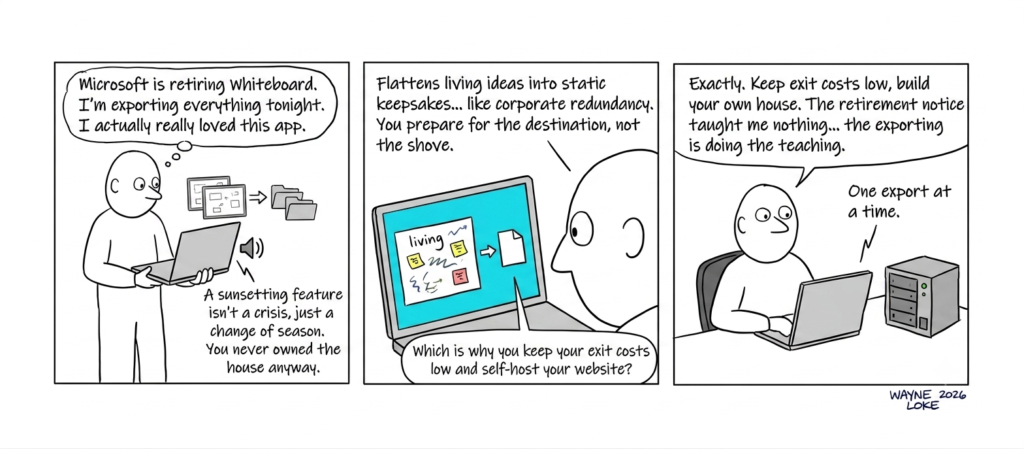
    Which brings me to the thing I got wrong for years without noticing. My boards lived on Microsoft’s servers, and somewhere along the way I started treating that as mine. It felt like a home. It was a rented plot on someone else’s land, and the export deadline is the letter reminding me whose name is on the title. I never owned the board. I rented a spot, paid nothing for it, grew comfortable in the rhythm, and mistook the comfort for ownership. That is the quiet trick of permanence. We rent it on someone else’s cycle, settle in, and forget we don’t hold the deed, right up until the landlord sends notice.

    The deadline is doing something else too, something I only half enjoy. It is teaching me, and it is charging tuition in my own hours. Nobody is forcing me to save these boards. If I let the date slide past, the work simply vanishes, and no one but me will ever notice it’s gone. So I sit here, export by export, paying for the lesson with an evening I won’t get back. The retirement notice taught me nothing. The exporting is doing the teaching.

    I notice, too, what the export actually does to the thing I’m saving. A board inside the app is alive. I can move a box, redraw an arrow, wipe a corner and change my mind, come back next week and keep going. The moment I save it to PDF, it stops being a place I work and becomes a picture of a place I used to work. The living surface flattens into a keepsake. That, in the end, is what keeping usually amounts to. We can’t hold on to a thing while it’s still moving, so we hold on to a still image of it and call that a memory. The boards I’m rescuing tonight will survive as pictures. Not one of them will ever be drawn on again.

    A comic about Microsoft retiring Whiteboard and why it pays to keep exit costs low so that you are in control.

    Then there is the cost people underestimate when they talk about switching tools, as if moving were only a matter of matching a feature list. The cost is fluency. I didn’t just use Whiteboard, I became fluent in it. I knew without thinking where every control sat, how it behaved, what it would let me get away with when I was working fast. Moving to something else means learning a new grammar with my hands all over again, being clumsy for a while, being slow before I’m quick. That re-learning is the tax, and I’ve paid it before in far bigger denominations than a drawing app.

    The bigger version

    I know that cost because I’ve lived a larger version of it. My own role ended in November 2024. I was made redundant, and I stepped from there into early retirement. Here is the wrinkle. I was ready for the retirement. I was not ready for the shove that started it. Being prepared for the destination is not the same as being prepared for the hand in your back that sends you there ahead of schedule. One of those I had planned for over years. The other arrived on someone else’s timetable, decided on someone else’s ledger, and handed to me as a fact I had no vote in.

    I won’t dress that up into more than it was, and it wasn’t only a line in a budget either. The same ache turns up wherever something with a rhythm ends, whether it’s a tool you loved, a job you were good at, a house you lived in for twenty years, or someone you kept close. I’ll leave that there. You can put your own face to it more accurately than I can put mine.

    What I carried out of it is the same thing I’m carrying out of this small evening of exporting. The capability walked out of the building with me. Whatever made me useful was portable, even after the reason for keeping me around got closed off on an account I never controlled. From inside the notice, renewal looks like a tragedy. Step back, and it’s the cycle doing what cycles do, turning, and carrying the value that actually mattered into whatever comes next.

    Keeping exit costs low

    Two things this is not. It isn’t a call to nostalgia, and it isn’t a call to hoard every tool you’ve ever touched. If I tried to own everything, host all of it myself, keep a private copy of half the internet in a cupboard, I’d drown in my own caution, and I’d deserve it. The useful move is smaller than that. Keep your exit costs low.

    That’s why I run my own WordPress on my own hosting rather than writing inside someone’s walled app where my words are a guest. It’s why I build network storage out of old machines that were headed for landfill, and keep my own copies of the things that matter to me. It’s why, when I make something I care about, I keep it in a format I can carry off the platform on the day the platform decides it no longer wants to host me. Not because I distrust every vendor, that way lies paranoia, but because I’ve read enough of these notices to know the ground you stand on belongs to whoever can send you one. Every notice like tonight’s is tuition for the same lesson about who controls that ground. I’ve decided to keep learning it cheaply, in advance, on my own terms, instead of expensively, in a hurry, on theirs.

    So I’ll finish exporting the boards. I’ll be clumsy in whatever I use next, for a while, until my hands learn the new room. Nothing I rely on is forever, and I’ve made my peace with that, one export at a time.

    [Editor’s update, 23 August 2026: Microsoft has since moved the dates. Whiteboard for personal accounts now goes read-only on 22 September 2026 and retires on 16 October 2026, a little more runway than the first notice gave. I didn’t wait for it. I’ve exported every board and deleted the .whiteboard files myself, on my own schedule instead of theirs.]

  • Vibe Coding: A Macro Early-Warning Dashboard

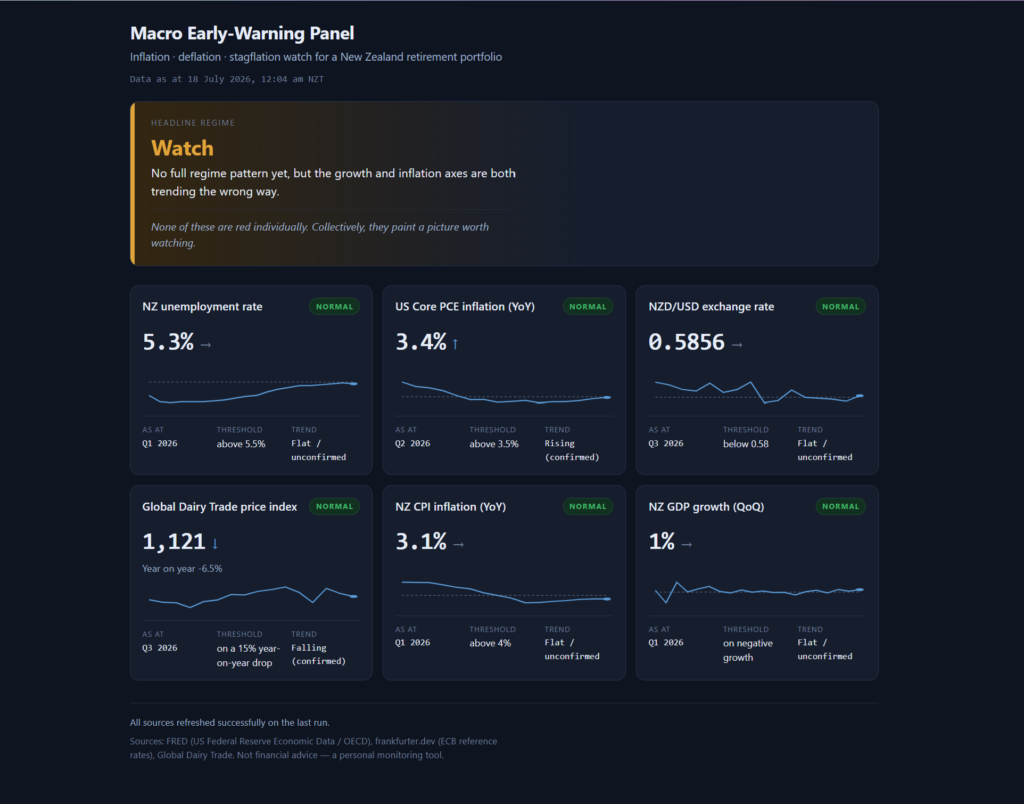
    A macro-early warning dashboard showing six panels with economic indicator to predict the current economic situation as normal, inflationary, deflationary or stagflationary.

    Four times a year, when Stats NZ releases the CPI, I open an Excel spreadsheet and type the number in by hand. Unemployment when it comes out, the exchange rate, dairy prices, GDP, US inflation; each one found on a different website, copied across, checked against the previous quarter. I have kept this spreadsheet going for some time now, and an early-warning panel that only warns when I remember to feed it is not much of an early-warning panel.

    Some context on why I bother. Years ago, while I was still at ABN AMRO, I took the Certified Financial Planner course and passed the certification, never to practise it in public; I learned it to manage my own money, and the knowledge served me well. Now, as an early retiree, that decision pays for itself, because it pays to manage your own portfolio well rather than paying someone else to do it, and I am running mine through decumulation, where the macro regime matters more than any single stock pick, because the regime decides how much risk I should be carrying at all. What I watch for are the three conditions that hurt a retiree’s portfolio in different ways: inflation, deflation, and stagflation. Over the years of manual tracking I settled on six indicators with hard triggers: NZ unemployment above 5.5%, US Core PCE inflation above 3.5%, the NZD/USD below 0.58, a 15% year-on-year drop in the Global Dairy Trade index, NZ CPI above 4%, and a negative quarter of NZ GDP. The signal I care about sits in the pattern across all six.

    Some time back I tried to automate this myself in Python. I struggled, honestly. Part of it was the programming; the bigger part was discovering how many variables I hadn’t accounted for: which API carries which series, how each source dates its observations, what happens when a feed goes quiet. I gave up, and the spreadsheet won by default. Tedious, but it worked, in the way that typing numbers into cells every quarter “works.”

    Then this year, with everyone talking about vibe coding, I decided the idea deserved a second attempt, this time with Claude Code doing the typing.

    Under two hours

    I wrote the request the way I would brief a contractor. The six indicators and their exact trigger thresholds. Two layers of logic: per-indicator status with a small history chart and a trend arrow, and above that a headline regime call (stagflation risk, inflation risk, deflation risk, watch, normal) driven by confirmed trends across three axes, where a confirmed trend means 3 consecutive quarters moving the same way. The hosting constraints: my WordPress site runs on Hostinger shared hosting, so the whole thing had to be one PHP script on a scheduled cron writing a data file, plus a static page reading it; no database, no server process, a folder I copy into public_html and it just works. I attached an image of how I wanted the dashboard laid out. And I defined done: the fetch runs end to end against live sources, the page renders against real data, the regime logic is proven by tests, and one data source gets deliberately broken to show the failure handling works before anyone tells me it’s finished.

    I ran the prompt, revised it once, and end to end, from idea to a working dashboard tested against live data, we spent more than an hour but less than two. And the constraint was me. The machine was rarely waiting on itself; it was waiting on me, because at every fork I was validating and verifying with my own eyeballs before letting it move on. Two hours still surprises me when I type it, given what the same idea cost me in Python.

    The two hours themselves are the part worth describing. Claude Code narrates as it works, a running commentary of what it’s checking and why, and some of it needs my answer, so I was reading the whole way through while keeping one eye on the token meter to see what all this thinking was costing me. And the commentary showed it thinking past the literal instruction. Before writing a line of code it verified every data source was actually reachable, because the whole architecture hinged on that. The Global Dairy Trade index has no public API and loads its numbers by JavaScript, so it read the site’s own app code, found the static JSON feed the charts call, and wired the scraper to that, built to shout if the feed’s shape ever changes rather than print a wrong number. When it found that the Stats NZ API needs a subscription key I hadn’t supplied, it declined to ship an untested adapter with guessed identifiers, saying plainly that claiming untested code works would be lying, and documented the upgrade path instead. It drew a distinction I hadn’t asked for, between a fetch that fails (mark the indicator Stale, keep the last good value, force the headline to Watch) and a source that succeeds but lags at origin (show the true data date and let me see the age). And at the end it broke the GDP feed on purpose, confirmed the Stale badge, the forced Watch and the error exit code all fired, then restored a clean run. The final test suite passed 23 out of 23.

    Where we got stuck

    One indicator refused to cooperate: NZ CPI. The US Federal Reserve’s FRED database carries nearly everything, including the NZ series via an OECD re-cut, and unemployment and GDP came through current. But FRED’s NZ CPI lagged 4 quarters behind, showing 2.5% for Q1 2025 when the real figure was 3.1% at Q1 2026. On a panel whose whole purpose is early warning about inflation, a year of lag on the inflation number is the one gap that matters; 3.1 sits a lot closer to my 4% trigger than 2.5 does.

    So we hunted together. I suggested the Reserve Bank of New Zealand’s key indicators page, and we tested it in the browser side by side: the data is there, fresh, with history back to 1926. But the page sits behind F5 bot defence, so a PHP cron job gets served a JavaScript challenge instead of the numbers. Lovely data, unreachable by automation. Then I pointed at Stats NZ’s Infoshare, and it drove the site all the way to the export form before reporting back: the direct export needs a 42 KB form-state blob round-tripped on every call, an uploaded query file, and the full period list posted back, all behind Cloudflare. Technically scriptable, and it would snap the first time Stats NZ touched that page.

    The irony is not lost on me. I worked at Stats NZ. Their numbers are the authoritative ones, and theirs was the single source we could not automate cleanly, because the proper API wants a subscription key and, worse, wants you to already know which of their scattered data products you’re requesting. That discovery problem put me off registering a key at all; it’s now a question I’m taking to my network contacts, to find the right API path for CPI and maybe GDP.

    Where we landed is almost embarrassingly simple: a manual quarterly entry. CPI comes out 4 times a year, and each release I add one line to a config file, the same number I’ll be reading in the news anyway, while FRED’s older history fills in behind it for the chart. Mistype it and the card goes Stale, loudly. Thirty seconds a quarter, no key, no fragile scraper. For a quarterly series, that’s a better fit, and it replaced a spreadsheet’s worth of typing with one line.

    What it actually felt like

    The closest comparison I have is pair programming: one person at the keyboard, the other watching, questioning, supplying context the typist doesn’t have. I sat with 2 browser windows open, one reading the commentary and watching the tokens tick, the other checking the same data sources myself, verifying what it told me against what I could see. When it hit a fork it stopped, named the fork, and gave a recommendation; I made the call and it kept moving.

    And the division of labour is what made 2 hours possible. The machine did the engineering I had already proven I couldn’t do alone; that Python attempt settled the question years ago. I did the parts it couldn’t: knowing that RBNZ and Infoshare existed as alternatives, judging that a manual entry is acceptable for a quarterly series, and above all knowing which six numbers matter and where the triggers sit, which came from the long stretch of doing the job by hand in Excel. The code took less than 2 hours. The specification took years of quarterly typing to earn. I suspect that ratio holds for most people trying this: the prompt worked on the first serious pass because I could define done precisely, and I could define done precisely because I had been the system I was replacing.

    I briefed it like a contractor, with constraints and done-criteria. I attached a picture of the outcome. I stayed in the room the whole time, reading the commentary, because the questions it asked were exactly the ones worth answering well. And I checked its claims independently while it worked, the same courtesy I’d extend to any capable colleague I’d only just met.

    The first real run of the finished dashboard came back Watch: dairy prices falling into rising US inflation, the dollar leaning on 0.58, nothing red on its own. Which is precisely the framing line I asked to be kept visible on the page: “None of these are red individually. Collectively, they paint a picture worth watching.”

    The dashboard is now live beside Strategic Kata. The cron runs on the 1st and 15th of each month, timed to the Global Dairy Trade auctions, the fastest-moving of the six feeds; the quarterly series refresh as their releases land, and the one CPI line each quarter is the whole of my remaining manual labour.

    The spreadsheet is retired. I guess that makes two of us.