Energy sits at the base of everything. When global oil flows get disrupted, that disruption doesn’t stay in the energy sector, it travels through the whole system: into transportation costs, which feed into food prices at the supermarket, into manufacturing, which moves through supply chains before landing on retail shelves, into LNG, which New Zealand imports. Once energy rises, everything rises. That’s just how the mechanism works.
I’ve been watching three macro scenarios for the New Zealand economy: stagflation, inflation, and deflation. They’re easy to conflate, and the confusion matters because the responses to each are different, sometimes opposite.
The definitions get muddled in most coverage.
Inflation is when economic growth is rising, prices are rising, and unemployment is falling. You’re paying more, but you also have a job and likely a pay rise. Uncomfortable, but manageable if you’re positioned for it.
Deflation is when economic growth slows, prices fall, and unemployment rises. Prices going down sounds good until you realise the economy is contracting and jobs are disappearing.
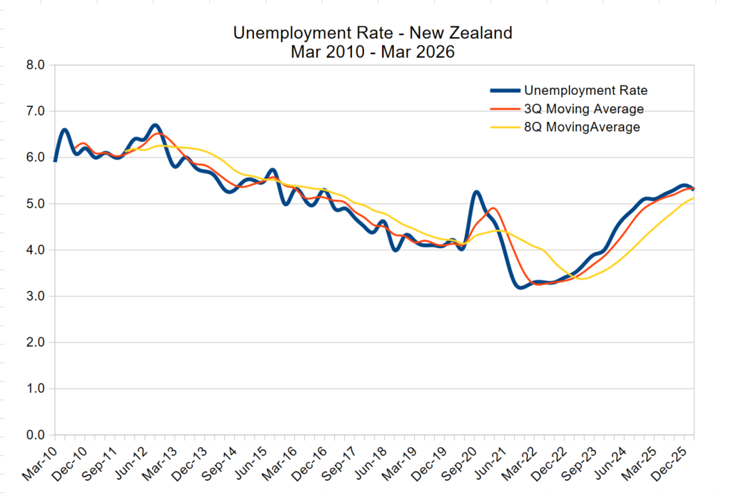
Stagflation is the ugly one. Economic growth slows, inflation stays elevated, and unemployment rises. You get the worst of both: a contracting economy that still costs more to live in. There’s no relief valve. Slow economy, high costs, rising unemployment, all at the same time.
That’s the scenario worth watching right now.
Why New Zealand is unusually exposed
Small open economies don’t carry many buffers, and New Zealand is about as open and as small as it gets among developed countries.
We import energy, capital, and most manufactured goods. Our household wealth is disproportionately tied up in housing. Domestic consumption drives a large share of GDP. That combination creates a specific structural vulnerability: even when domestic demand weakens, imported inflation can stay sticky. Costs keep rising even as the economy contracts.
A global oil disruption that barely registers for a large, diversified economy with domestic energy production lands differently here, because there’s less in the system to absorb the shock. It passes through more directly into the price of petrol, which passes into groceries, which passes into the cost of running a household.
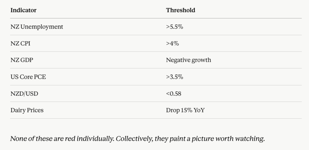
New Zealand’s dairy export earnings are also worth watching. Dairy is a primary current account earner. A 15% year-on-year drop in dairy prices hits the exchange rate, which hits the cost of everything we import, which hits household budgets. These things connect. Pull one and you feel the others move.
The NZD/USD rate matters for the same reason. A weak kiwi dollar makes every imported good more expensive, and in a country as import-dependent as ours, that’s most goods.
The 1970s rhyme
History doesn’t repeat exactly, but it rhymes often enough to be worth paying attention to.
Structurally, the world today is beginning to resemble the 1970s in ways that haven’t been true for 50 years: fragmented geopolitics, high commodity sensitivity, governments running large deficits while managing inflation, weakening productivity growth across developed economies. The exact causes are different. The shape is similar.
The 1970s stagflation hit savers hard. Fixed income returns didn’t keep pace with inflation. Equities stagnated in real terms for extended periods. The people who preserved purchasing power were the ones who understood what was happening at the structural level, not the ones reacting to daily news cycles.
We may be entering a similar period. I’m not saying it’s identical. I’m saying it’s rhyming, and that’s usually enough to be useful.
Financial repression, quietly
Governments carrying excessive debt have a limited menu of options. They can default outright, but advanced economies almost never do this, because central banks can print money to service the debt. They can cut spending dramatically, which is politically very difficult to sustain. Or they can do what actually tends to happen: allow real returns to go negative over a long period, quietly.
Inflation erodes the real value of the debt. Currency debasement helps. Keeping interest rates below inflation suppresses borrowing costs for the government. Taxation takes its share of any nominal gains. None of it gets announced as policy. It happens through the cumulative interaction of those levers, and it slowly transfers wealth from savers to debtors, with governments being the largest debtor in the system.
This happened after World War II. It happened through major debt crises across the 20th century. It’s a well-documented mechanism, and it tends to be the path of least political resistance when the debt load gets large enough. The process is gradual, which is exactly why most people don’t notice it until years later when they try to understand why their savings feel like they’ve shrunk.
I think we may be entering another version of that environment.
The maths that should concern you
Here’s where it gets concrete.
At current settings (April 2026):
OCR at 2.25%. CPI at 3.1%. Assuming a 30% tax rate on interest income, which applies to most working New Zealanders.
Work through it:
2.25% interest earned on savings. Minus 30% tax leaves you about 1.58% net. Against 3.1% inflation.
You’re losing roughly 1.5% purchasing power every year in a “safe” cash position. Before currency risk. Before fees. Before any consideration of whether the official CPI figure accurately captures your actual household cost of living, which, for most people, it understates, because the basket of goods they measure doesn’t weight housing and food costs the way most household budgets actually do.
The money is still there, nominally. But it’s buying less every year. It’s a slow drain.
In a stagflationary environment, where both inflation and currency pressures can worsen simultaneously, the erosion speeds up. The nominal number in your savings account can go up while the real number, what it actually buys, goes down. That gap is the trap.
The instinct many people have at this point is to reach for higher yield, take on more risk to generate more return. That impulse is understandable, and it can also be exactly wrong if it leads you toward credit and duration risk you don’t fully understand. Higher-yield instruments aren’t free returns. The risk is real, and it tends to surface precisely in the kind of environment we’re discussing.
Most of the mental models people use for financial safety were built in a different era, when real interest rates were positive, global trade was expanding, and geopolitics was relatively stable. Those conditions no longer reliably apply.
What I’m actually watching
Most of it is calibrated for engagement, not for helping you think clearly.
The indicators worth tracking: the Global Shipping Cost Index, because it moves before consumer inflation does, it’s a leading indicator; NZD/USD, because our currency exposure runs directly through household costs; US Core PCE, because American monetary conditions still set the global tone, and if the Fed stays tight, the RBNZ has limited room to cut without making our currency situation worse; and dairy prices year-on-year, because that’s where NZ-specific external shock shows up first.
The most useful thing to track is your own household cash flow. What your income actually buys, month to month. That’s where the real economy shows up, usually well before the official numbers catch up.
If what you buy every week is noticeably more expensive than 12 months ago, and your savings return isn’t keeping up, you’re already inside the scenario I’m describing. You don’t need a macro framework to confirm what you’re already feeling in your grocery bill.
One closing thought
In a stagflation and geopolitical shock environment, real purchasing power erodes fast, even when the savings balance looks fine on paper.
I’m not calling a specific outcome. I’m watching the indicators, understanding the structural conditions, and thinking about what they mean for my own financial position.
This is not financial advice. It’s what I’m doing.
The world looks more like the 1970s than it has in 50 years. That’s probably worth more than a passing thought.